Real Britain Index (RBI)
27 October 2014


Despite a return to economic growth over the last year or more, standards of living for most people are still declining. Prices are rising ahead of an increase in wages, resulting in a fall in real incomes across most of the population. The government’s preferred measure of inflation is the Consumer Prices Index (CPI) which attempts to capture the “average” experience of price increases across the population.
However the CPI is flawed as a measure of real living standards, calculating expenditure for an “average” basket of goods. However there is no such thing as an “average” household — spending money on housing, food, and utilities is unavoidable and so poorer households devote more money, proportionately, to them.
The “Real Britain Index” is an alternate measure of inflation, comparable to CPI, that makes allowance for the fact that those on different incomes spend their money differently.
1. The CPI is flawed as a measure of real living standards. To measure price increases, it uses a “basket of goods”, constructed to reflect typical consumption patterns. The contribution of price changes in each good and service in the basket is weighted by the proportion the average household spends on it.
2. However, there is no such thing as an “average” household. What households buy varies, depending not only on who is in the household, but also how much money the household has. In particular, poorer households spend proportionately more on essentials than do richer. Spending money on housing, food, and utilities is unavoidable and so poorer households devote more money, proportionately, to them.
3. But it is these essentials that have seen some of the biggest increase in prices over recent years. Whilst the price of (for example) electronic goods have fallen dramatically, and likewise overseas travel, essentials have seen a large increase in prices. These increases, as a result, will hit poorer households harder than the better off.
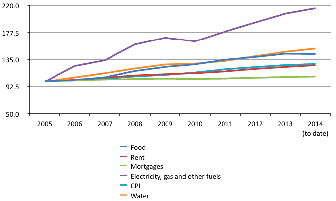
4. Food prices are up 43% since 2006. Water bills have risen 52%. And prices of electricity and gas have gone up by 115% since then. Only housing costs, outside of London, have been relatively more restrained.
5. The CPI measure shows average prices increasing only 26% over this period. Since average (median) money incomes have risen 19%, even this implies a 7% decrease in median earnings.
6. But once we allow for the variation in spending patterns by those on different incomes, the pattern becomes even more stark. We can show this impact by recalculating the rate of inflation for different income groups. The graph below shows the total increase in prices each 10% of the population, grouped from poorest to richest, have faced since 2006.
7. This is the “Real Britain Index” – an alternate measure of inflation, comparable to CPI, that makes allowance for the fact that those on different incomes spend their money differently.
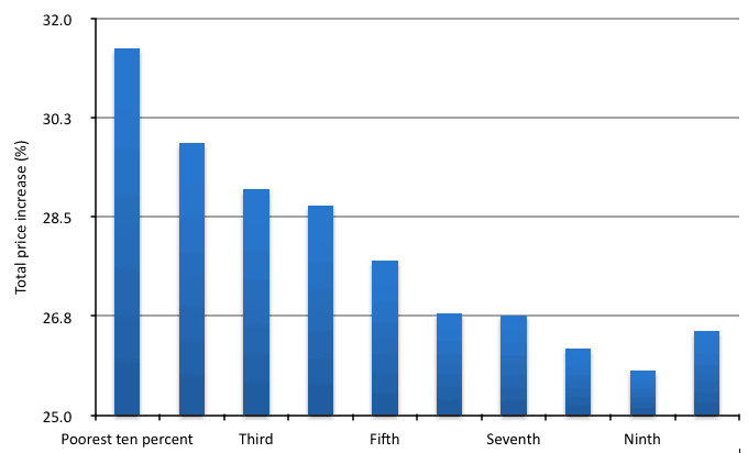
8. Very consistently, the poorest have faced higher inflation than the richest. (The slightly higher rate for the richest 10% seems to substantially the result of rapid increases in school fees!). These new rates more accurately capture the experience of rising prices for those on different incomes.
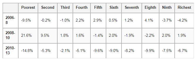
8. Using data on earnings from the Office for National Statistics (ONS), we can then compare these new inflation rates with changes in money incomes for each group. We show the cumulative effects of price and money earnings changes for each tenth of the population, sorted by income, since 2006.
10. It is very clear that the period 2010 – 13, following the general election, represents a break with not just the years pre-crash, but also the years immediately following the crash, during which time incomes at the lower end of the population, in particular, held up comparatively well.
11. It is also apparent that the largest recent squeeze on incomes occurs somewhat above the squeezed middle, from the fifth to the eighth deciles. This covers those earning average pay from roughly £19,700 to £43,400 a year.
12. To give some sense of what these figures mean, a typical civil servant, earning the median pay for the civil service of £24,000, would face an RBI inflation rate of 2.36%. A typical nurse, again earning the median pay, would face and inflation of 2.37%. With CPI at 1.6%, it is clear that pegging pay increases to CPI would lead to a real loss of income.
Change to post-tax income, selected periods, 2005 – 2013
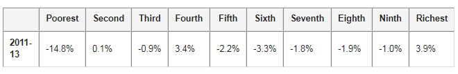
13. However, if we look at the last year for which data is available, it is also apparent that the bias of income changes is strongly favouring the wealthy. Whilst the very poorest saw a shocking 14.8% drop in their income in a single financial year, driven by welfare changes, the richest 10% saw their real incomes increase by 3.9%, after some years of decline.
Change to post-tax real income, 2011/12 – 2012/13
14. Inequality appears to be rising again, and the effects of the inflation difference will exaggerate this.
15. There are a number of barriers that can be raised against the worst effects of this differential. A freeze on utility prices, in particular, will have a redistributive effect. More effective, however, will be a drive to increase money earnings, particularly in the lower 70% of the income distribution.
Topics Macroeconomics