Five charts that reveal the divide between England’s cities and towns
We're working with people in towns to help bridge the gap.
17 October 2017
Towns and cities have always been divided. They have always been home to different types of people and different patterns of economic activity. But new research by Professor Will Jennings for the New Economics Foundation reveals the true scale of the divide. These five charts set out Professor Jennings’ findings.
1. In the 2017 general election, Labour racked up a huge lead in cities but lagged behind in small towns.
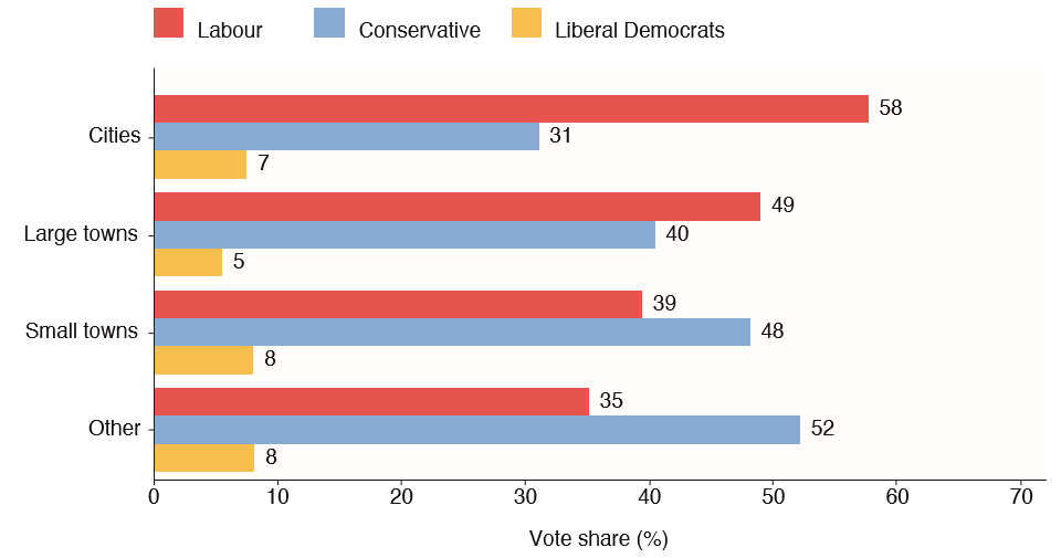
In the general election this year, Labour racked up a huge lead in cities – but lagged way behind in small towns and other less urban areas. Of course, it’s not surprising that Labour did well in cities – for some time cities have been a bedrock of their vote. But the scale of the divide is striking. And when we start to look at the historical trends, the picture gets starker.
2. Labour’s vote swelled in 2017, but the swing was uneven.
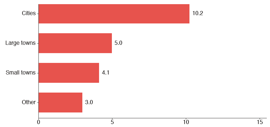
The overall story of the 2017 election was a big improvement in the Labour vote since 2015. But when you delve into the places where people live, that swing towards Labour was uneven. The more urban the place, the bigger the swing.
3. Labour fell behind the Conservatives in small towns after 2005.
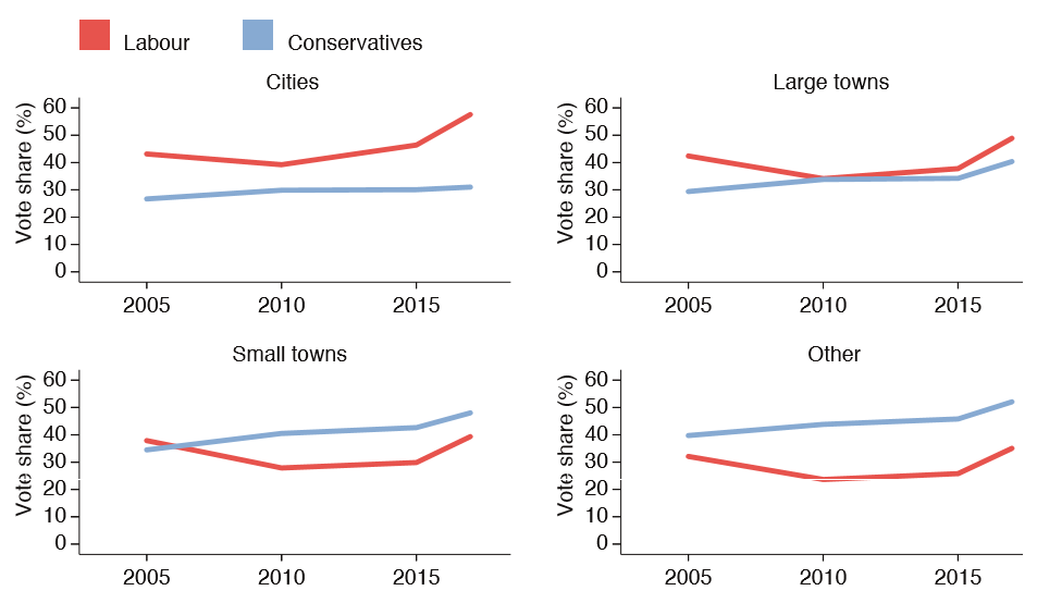
Looking further back, in 2005 the Conservatives were behind Labour in small towns. But this year, despite the overall swing towards Labour, the Conservatives are well ahead in small towns. Meanwhile Labour has racked up a huge lead in cities. But it wasn’t always that way.
4. Before 1992, Labour trailed the Conservatives in cities.
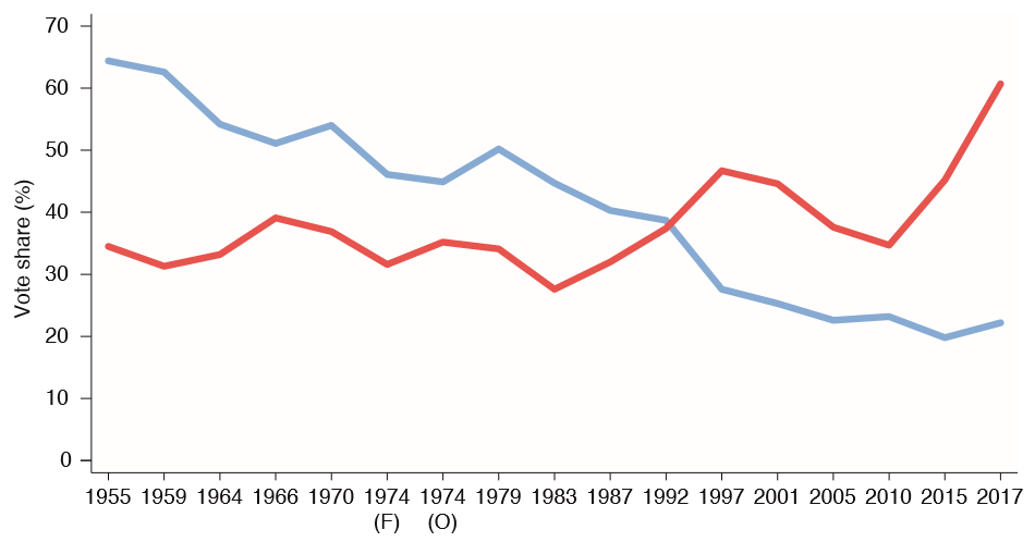
Back in the 1950s, and right up to 1992, the Conservatives had a healthy lead in the cities. It is only in more recent years that the huge Labour lead in cities has emerged. That points to long-term trends driving a new political division. And the first place to look is the economy. Using an ‘index of economic decline’, Professor Jennings shows that places which have declined economically over time are much more likely to be towns, while the 20 fastest-growing places are all in cities. So when we look at electoral results against this index of decline, we can see a further interesting pattern.
5. Since 2005, Conservative vote share has increased most in areas of economic decline, while Labour has thrived in more insulated areas.
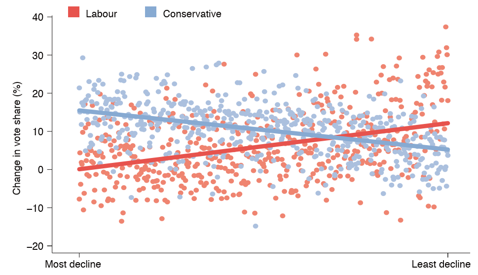
Since 2005, the more economic trouble a place is in the more likely it is to have increased its vote-share for the Conservatives – and for Labour it’s vice versa. That is a telling demonstration of what may be driving the division between towns and cities.
Together, these charts paint a picture of a country divided both politically and economically. At the New Economics Foundation, we are working with people in towns to start taking control of their futures by building local economies from the ground up. Our ‘manifesto for towns’ supports good local jobs and infrastructure, and genuinely empowers people in towns.
Topics Local economies


